It’s all about timing.
Yesterday afternoon, not long after the stock markets closed in New York, Apple put a one-paragraph announcement on its Hot News page. The announcement told the world (or whoever happened to be watching that page) that because Leopard resources had been used to finish up the iPhone, Leopard would be delayed. Instead of seeing the finished OS in June, we’ll now see it in October.
Why it Matters to Me
I took the news with mixed emotions. I had begun working hard on my Leopard Visual QuickStart Guide for Peachpit Press. The book will be the eighth or tenth (I’ve lost count) edition of my Mac OS VQS, which is one of my biggest selling titles. The book is important to me; the last edition accounted for half of my annual income for two years in a row. When that book is ready to write I drop everything — even helicopter charters — to work on it.
The most important part of it is getting it done on time. When Tiger came out in 2005 only two authors had books in stores beside the brand new software on its release date: Robin Williams and me. Both long-time Peachpit authors with reputations for churning out books that satisfy readers. If Robin’s book sold only half as well as mine — and I’m not fooling myself; it probably sold twice as well — we kicked butt. It was a great reward for hard work and grueling deadlines. But I have to say honestly that my Tiger book was one of the ones I’m most proud of.
This Time was Different
This time around, things were definitely different. The software wasn’t ready yet — that was obvious in the way certain features just didn’t work right. Lots of bugs to iron out, but few developmental releases. It was almost as if Apple’s Mac OS team was overwhelmed. This announcement from Apple explains a lot. Apparently they were overwhelmed, but not by the task at hand. They were overwhelmed by being shorthanded to tackle the task at hand.
Add to that the fact that my screenshot software of choice, Snapz Pro, “broke” in Leopard. Don’t misunderstand me; it did work and it took fine screenshots. But the shortcut key to invoke it did not work — even when I fiddled with Mac OS settings and tried other shortcut keys. So, for example, there was no way to take a screenshot of a menu.
I don’t know if you’ve ever seen a Visual QuickStart Guide, but they rely on screenshots to communicate information. The book is full of step-by-step, illustrated instructions. I estimate that my Tiger VQS has at least 2,000 screenshots in it. Some screenshots show windows, others show menus. Almost every single one is less than a full screen of information. Now think of how much fun it might be to take 2,000 screenshots with something as awkward as Grab or, worse yet, Apple’s built-in screenshot shortcut keys. And then manually edit every single screenshot in a graphics program like Photoshop. Not having Snapz Pro (or something equivalent, if something equivalent exists) was going to seriously slow down my workflow.
What was even worse for me (and all other writers, I assume) was the “secret features” Steve Jobs alluded to when he first showed off Leopard. I had no idea what they were. And no one else did either. What if those features changed the way part of Mac OS X looked? All my screenshots would have to be redone. And what if the features were big enough to warrant their own chapters? Or replaced existing features? That could mean significant reorganization of the book, with changes to all the chapter and feature references. I could be working my butt off to finish a 700+ page book, only to have to redo major parts of it.
So I was under a lot of pressure. I had the ticking clock that said the software would be out “this spring.” That meant before June 20. I knew my publisher needed 2-3 weeks to get the final files printed and turned into books. That meant I needed to be done writing and editing by the end of May. But not knowing what the future would bring, was crippling me, making it difficult and frustrating to get things done.
I was not a happy camper. So when the announcement came yesterday, it was a bit of a relief for me.
The Problem with the Postponement
There is a problem, however: timing.
I had planned to work on my Leopard book for April and May. Then comes my annual secret project (which I can’t talk about until after publication) for the month of June and a bit into July. Then my annual one-month stay at Howard Mesa to get some work done on our property and knock off a few articles for Informit and possibly try to reconstruct that mystery novel I was working on (which was lost in the great hard disk crash and backup screw-up of February 2007). Then we’d planned to take a vacation to the northwest to continue our search for a new place to live. By that time, it would be September and the helicopter business would be heating up again; I already have two charters lined up for that month. Also, around that time, I’d be ready to start work on my Word for Macintosh revision.
There was a plan B for this summer, too. It consisted of me getting a job as a pilot for someone else, flying somewhere other than Arizona. I could work on my secret project while I was away and escape Arizona’s brutal heat and get to fly someplace different. I have a very good lead on a job in St. Louis (of all places) and a few possibilities in Oregon and Washington. But nothing finalized.
Now these plans for the next six months of my life are completely up in the air. Assuming an October 1 release of Leopard — this is just a date pulled out of the air; I swear I don’t know anything and if I did I wouldn’t repeat it — I have to be finished with the book by the first week in September. So I’ll work on it in July and August. While I still have my secret project to work on in June, I don’t have anything lined up for the rest of April and the month of May.
What’s even worse about all this is that I can’t work on a VQS at Howard Mesa or at a summer job elsewhere — I need a desktop computer with a big monitor to do the layout — and I can’t take a vacation when I need to work on this book. (See above for how important it is.) So my whole summer schedule is completely screwed up.
And It’s a Money Problem, Too
And since I get paid advances when I work and I don’t have anything lined up between now and the beginning of June, I’m not going to see a payday until the end of June or July. Ouch. So my finances will be screwed up, too.
It gets even worse. If the book had a release date in June 2007 (with the original release of Leopard), I’d start seeing royalties at September 2007 month-end. But because it won’t be released until October, which is after the start of the last quarter, I won’t see royalties until March 2008 month-end. That’s a 6-month payday delay for a 4-month publication delay. Double-ouch.
But that’s what the freelance writer’s life is like: a financial roller coaster.
What to Do?
Today I’ll be making some phone calls. The goal is to pin down exact dates for all of my known projects so I can decide, once and for all, if I can get a pilot job according to Plan B. And, while I’m at it, I’ll try to pick up a small book project to work on in May. (Not likely but remotely possible.)
Then I’ll get to work doing other things that I’ve been neglecting — cleaning out the condo I want to rent, washing the helicopter, organizing my office, reserving rooms for next year’s Southwest Circle Helicopter Adventure trips.
After all, life goes on.


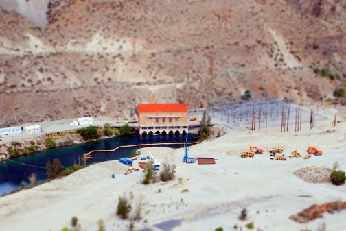
 And here’s a shot from last January’s visit to San Francisco. That’s the dome of City Hall with Sutro Tower in the background. I took the photo from my hotel room at the Nikko. I think it comes across pretty well as a fake miniature.

 Antelope Canyon is an incredible slot canyon cut through Navajo sandstone. At certain times of the day at certain times of the year, the sunlight enters the top of the canyon, illuminating it with a golden light. The canyon has been featured in many magazines, sometimes with shafts of light capturing particles of dust set in motion by the cool breeze. Everyone who sees these photos dreams of taking photos just like them.