Publish & Prosper: Blogging for your Business

A brief book review.

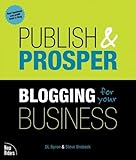
I just got a copy of Publish and Prosper: Blogging for Your Business by DL Byron, Steve Broback. This 200-page book is a good beginners’ guide for business blogging that starts with the basics and expands from there. For example, some questions that are answered include:

  • What is a blog?
  • Why should you blog?
  • Why shouldn’t you blog?
  • What should the focus of your blog be?
  • What does it take to start and maintain a blog?
  • What features should your blog include?
  • Should you include ads on your blog?
  • How do you monitor your blog’s usage?

Keep in mind that the book isn’t written for the average blogger. It’s written for business bloggers — people who want to use a blog to promote or otherwise market their business, products, or services.

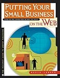
Oddly enough, the book reminds me of one of my old titles, Putting Your Small Business on the Web. (Although I’m providing a link here, I’m not suggesting that you buy the book; it’s horribly out of date and of little value at this point.) Both books take a very basic approach, explaining how a new technology (blogging in this book; the Web in my book) can benefit a business and how to get started. Both books appeal more to business people then tech-saavy people — in fact, if you have experience with the technology, you already know half the book’s content.

Overall, I think the book is a good read for any business person who isn’t already a blogger — or perhaps one who has just gotten started and isn’t quite sure of what he or she is doing. Although there are lots of tips between its covers for all bloggers, it’s the newbies that will get the most of this book.

CDs vs. Downloads

I couldn’t have said it better myself.

For the past few weeks, I’ve been thinking a lot about the inconvenience of downloading music from iTunes. Yes, you read that right. I said inconvenience.

Sure, it’s great to download music immediately, when I want it, and pay only 99¢ per song. But what’s not so good is the restrictions on music use:

  • I must register every computer I want to play my purchased songs on and I only get 5 of them. That covers my desktop Mac, my PowerBook, my Mac test mule (for writing Mac books and articles), my Windows test mule for writing Windows books and articles), and my husband’s laptop. About a year ago I was faced with a not-so-unique problem: the motherboard on my dual G5 went bad and needed to be replaced — before I could unregister it from iTunes. I lost one of my computer registrations and had to do battle with Apple to get it back.
  • I can’t easily back up my purchased music. I need to go through some kind of procedure that I simply haven’t had time to explore. In fact there seem to be restrictions on how I copy the music, period.
  • Apparently, there is some loss of quality if I burn purchased music to a CD and then rip that music to a computer. I haven’t played around with this enough to have the full story, but I shouldn’t have to spend the time to figure out why my music quality should change. It shouldn’t change.

Fortunately, I have an iPod (or three) so the fact that iPods are the only MP3 players that can play iTunes purchased music isn’t a problem for me. But I understand that it’s a major gripe for other people.

I was going to write a blog entry about all this, but now I don’t have to. I just read a piece that expresses my feelings and frustrations on this matter better than I could. From Alpha Geek: CDs vs. Downloads on Lifehacker:

DRM, the chief source of all this grief, is the love child of Satan and Osama bin Laden. If I could pay 99 cents for an unprotected, unrestricted, 320Kbps MP3, I’d do it in a heartbeat–and it would be all over for CDs. Instead, online music stores treat us like thieving children, locking us into one bit rate, one file format, a limited number of CD burns, and other annoying handcuffs. Apple and Microsoft impose the worst kind of restriction: Songs purchased from iTunes and Zune Marketplace can be played only on iPods and Zunes, respectively.

And later:

Call me old-fashioned, but I’ve rekindled my love affair with CDs. They let me do things, to borrow from Old Blue Eyes, my way. See you in hell, DRM.

Thanks, Rick Broida, for putting my thoughts into words. See you at the CD store.

5 Ways to Make Your Blog Posts More Readable

Learn five easy tricks to help pull readers into your blog posts.

Okay, so you’ve written an article for your blog and you’re all ready to publish it online. You’re confident that the article’s content is well-written. And you’re sure it will appeal to your blog’s regular readers.

But wait! Before you put it out to be read by the world, have you done what you can to make it more readable?

By readable, I mean formatted in such a way that visitors will be drawn into its content and want to read every word. Or have you simply composed 20 paragraphs of good, solid information, formatted as big solid blocks of text?

No matter what blogging tool you use to publish your blog, you should have access to the standard array of formatting features available in HTML. In this article, I’ll explain how and why you should use them.

Break Up Long Paragraphs

What’s less attractive on a Web page than solid blocks of text? Long paragraphs of unbroken text can intimidate readers. They look unapproachable, like a college textbook. (For me, they bring to mind the textbook in my college tax accounting course, which further reminds me of two semesters of boring hell on Mondays, Wednesdays, and Fridays.)

Break up long paragraphs at logical points. This will require some writing skill, since you can’t arbitrarily chop paragraphs up — each one must still communicate a complete thought. But shorter paragraphs are a lot less intimidating than long ones — a point that applies to sentences, too (although I can’t seem to get that one into my thick skull).

And one more thing about this: be sure to use a space between paragraphs (usually with the

tag rather than the
tag, if hand coding is required). On the Web, that’s the standard way to end one paragraph and begin another. Just starting a new line isn’t going to break the paragraph at all — at least not in the eyes of the reader.

Use Headings

Headings cue the reader about the content of paragraphs that follow them. For example, my Use Headings heading here tells you that I’m going to talk about headings in this paragraph and, likely the few that follow up until the next heading. Readers can scan your article’s headings to get a better idea of what the article covers.

Of course, there are two kinds of headings. There’s the kind that actually reflects what’s in the paragraphs they head — that’s what I’m using in this article. And then there’s the kind that doesn’t quite explain what the following paragraphs are about, but are humorous or witty. Both types can work, but for serious content, I recommend the first type.

Headings can also help with search engine optimization (SEO), but not being an SEO expert, I can’t elaborate much about this. I seem to recall reading that h1 and h2 level headings are more effective for SEO than other lower levels. I use h3 because that’s how formatting is set up on my blog and I’m not terribly concerned with SEO. If SEO is very important to you, you might want to look into this claim. Of course, for headings to be effective at all in SEO, they must be coded as headings using

and tags (or other level tags as appropriate) around them. The appearance of text coded as headings will vary depending on settings in your style.css file or other style information for your blog. (And now we’re getting a little more technical than I wanted to get in this article.)

Format Lists as Lists

If any paragraph in your article includes a list of four or more items that are longer than four or more words each, for heaven’s sake, format them as a list!

There’s nothing so boring or potentially confusing as long lists within a paragraph, especially when those lists include explanations, commas, and semicolons. Why worry about proper in-paragraph list formatting when you can simply create a bulleted or numbered list that’s clear and easy to read?

Lists, like headings, are also extremely scannable, making it easy for readers to get an idea of the content they include. They draw the reader in by giving them information in bite-sized chunks. Bold formatting used at the beginning of a list item (see below) can act as a heading, letting the reader know that an explanation or more information about the item follows.

In summary, lists can do the following for you:

  • Break up long blocks of text. Long lists in a paragraph make big, fat, intimidating blocks of text. Isn’t this much nicer?
  • Make one point easy to distinguish from the next. Since you (and your readers) don’t have to worry about how list items are separated (comma or semi-colon?) you don’t have to worry about someone misunderstanding list items.
  • Take advantage of built-in formatting options. I’m not just talking about standard bullets and hanging indents here. As you can see in this list, a blog’s style.css file can include instructions for graphic bullets or other fancy formatting.
  • Give your readers important points quickly. By presenting information in an easily scannable format, your readers can see what a list is about without wasting time. If it’s what they want to learn more about, they’ll dive in and read it.

Apply Other Formatting…but Sparingly!

There are other, more basic formatting features you can apply to text. Want some basic information to stand out? Use bold formatting (as I did in the bulleted list above). Introducing a new word or phrase? Italicize it. Got a quote to share? Here’s what I say:

If it’s longer than a dozen or so words, consider putting quotations between

and

tags. This clearly identifies the text as a quote from another author. (Well, in this case, it’s still words of wisdom from me, but you can quote me if you like.)

Don’t use ALL CAPS. It’s childish and unprofessional and considered by many to be “shouting.” And don’t use underlines. On the Web, underlines indicate hyperlinks and you can confuse your readers.

And don’t use too much formatting. There comes a point when the repeated application of bold and/or italic formatting loses meaning and simply fails to do the intended job.

Insert Illustrations

I’m a firm believer in the old adage: “One picture is worth a thousand words.” Maybe that’s why I’ve been writing Visual QuickStart Guides for Peachpit Press since 1995. Those books are full of screenshots — mine average 3-4 per page — and are excellent tools for teaching readers how to perform tasks with various software.

In regular writing — such as the writing you might do for your blog — images can also help communicate information. Did you write a software how-to piece? Screenshots of the steps would be extremely helpful. Did you write about a recent vacation? Include a few photos to show the scenes you’ve written about. Does your article explain the organization of a company or one of its departments? Include an organizational chart to put things in perspective.

On the Web, images do more than just communicate information. They also add visual appeal. Think about it as you visit sites on the Web. Which pages or blog posts caught your attention more? The ones without images? Or the ones with photos or drawings?

If you don’t have illustrations for your article and you want to include some other kind of graphic element, try text in a box. This effect, which is often used in print publications, can add visual appeal almost as much as an image can.

Let’s face it: people like to look at pictures. By giving them pictures that relate to your article, you can capture their attention and reel them in to read more about what the picture shows.

A word of warning here: Don’t use photos that don’t belong to you — doing so is likely a violation of copyright law. You can probably use company logos — if your use is consistent with the company’s rules governing logo use (normally available on its Web site) and you’re writing about the company. But taking photos off another Web site or scanning them out of a print publication for use on your site could get you in a lot of trouble. It’s stealing, plain and simple, and you could get sued. Use photos, screenshots, and drawings that you’ve taken or that you’ve received permission to use. The rule of thumb here is, if you don’t know whether you have permission to use it, you probably don’t.

Conclusion

As you can see, each of these techniques is relatively easy to implement on your blog. While it isn’t necessary to use all of them in one article (as I’ve attempted to do here), you can mix and match them as you see fit to liven up the layout and appearance of your prose.

The main thing to remember is this: the more interesting you make your text appear at first glance, the more likely you are to get readers to stick around and read what you’ve written.

Oh, and by the way, just about everything in this article also applies to your non-Web writing efforts: reports, articles, white papers, and books. You just won’t need HTML code to get the job done.

How to Contact Amazon.com Customer Support by Telephone

It’s easier than you think.

One of the annoyances of dealing with online companies is getting customer support by phone. Yes, there’s all kinds of information available on their Web site. But there are a lot of instances where the information that’s available online for your account simply doesn’t answer the question you have.

Like me, today, with Amazon.com. On December 26, I ordered a Caphalon One saucepan to complement the set my sister, brother, and sister-in-law so generously bought us for our Christmas/belated wedding gift. The pan cost a small fortune, so it qualified for free “super saver” shipping. My past experience with this free shipping is that if the item is in stock, it usually arrives 5 to 10 days after I place the order. I was in no real hurry, so that was fine.

But by today, nearly 3 weeks later, I still didn’t have the saucepan. I followed up on Amazon.com’s Web site and learned that the item had not yet shipped and was not scheduled to be shipped until January month-end — a full month after I placed the order. That was simply not tolerable. It was time to talk to Amazon.com.

Poking around the Help pages will eventually get you to a clickable button that you can use to contact Amazon.com by phone. Here’s the generic link: http://www.amazon.com/gp/help/contact-us/call-me.html/

imageHere’s how it works. You click the button (or above link) to get to a Contact Us by Phone page. You then click the Call Me button. A window like the one here pops up. Enter the phone number for the phone you’re nearest to and make sure Right Now is selected. Click Submit. Your phone rings immediately. Answer the phone. You’ll then be on hold for a short while until someone (most likely in India) picks up and begins reading to you off a script. If you’re lucky, that person will understand enough English to answer your question. If you’re really lucky, that person will be in West Virginia, like the person I got the first time I did this.

I went through this exercise today for my saucepan problem. The Indian woman on the other end of the line “upgraded” my shipping to standard at no charge. I’ll have the saucepan in 5 to 10 days. While this doesn’t answer the question of why shipping was delayed in the first place — that question was beyond her capabilities to answer — it does prevent any further delays.

Update: Want to comment or e-mail me with an Amazon.com customer service or technical support question? Read this first.

Earning Money with Your Blog

Without trashing it up.

Before I dive into this topic, I want to make it clear that I really hate the way some Web sites and blogs are so covered with advertising that it appears that the only reason the site/blog exists is to get visitors to click advertising links and earn money for the site/blog owner. You know what sites I’m talking about. It’s pretty obvious when advertisements take up more space in your browser window than the actual content you came to read.

(I’m actually involved with one of these sites. It’s a long story that’s still evolving. I’ll tell you more about it in a future article here. But my failure to provide the URL in this note should give you the idea that I’m not very proud of it.)

All that said, if you publish a Web site or blog and you’re not doing anything to monetize it, you’re leaving money on the table. And that point really hit home when I read that one of the bloggers I follow makes over $15,000 a month from Adsense revenue alone. Sheesh.

It seems that I need to walk a fine line between keeping my site free of advertisements (100% content per page, no revenue) and trashing it up with all the affiliate program and other advertisements I can get my hands on (25-50% content per page, some revenue).

After all, this site’s goal is not to make money. Sure, one goal is to promote my books and other work and support readers so they buy more books. And to attract new readers who buy books. There’s money there. But my other goals are to sound out about the things on my mind and take notes I can consult in the future about the things I do and see.

But can you imagine how much time I could spend doing, seeing, and blogging if my site brought in $15K/month?

(To be fair, you must consider the costs associated with maintaining such a site. If only 1% of a site’s visitors react to an advertisement by clicking on it — and that’s probably a high estimate — imagine how many visitors you need to crank up $15K of Adsense earnings. We’re talking thousands of page hits an hour. Those visitors eat up bandwidth at an alarming rate. Bandwidth costs money. So a bunch of that revenue is probably eaten up by hosting costs.)

One of the things that drives me is my own feeling towards advertising-heavy sites. I find them distasteful and I avoid them. That makes me think that if I filled my site with ads, people might use that as an excuse to stay away. Less visitors should mean less revenue, right?


Well, last week I started integrating Adsense ads into my sites. I’m trying to do it tastefully, with ads in various positions, depending on the site and the type of page. You may have noticed them. For the most part, they’re near the bottom of pages — which is not the recommended location to get clicks. wickenburg-az.com has a link unit across the top of the page, right beneath the header image. It’s color coordinated, so it fits in. There are text links at the bottom of single pages (that’s a page with a single article and all of its comments) on this site, and other text links in the sidebar for the Home and Category pages. wickenburg-az.com has a few image ads, which really concern me — some of them can be really tacky, with flashing graphics and obnoxious images. (I’m personally offended by some of the graphics in dating ads, like the ones you might see on Slate.com. They’re using women to sell sex.)

I also set up Adsense channels, which is another topic I need to write about here. They help me see where the revenue is coming from when I look at Adsense reports. Sure enough, my revenue stream took a big jump when I added the ads.

LinkShare  Referral  PrgToday, I set up LinkShare, an affiliate program that enables me to display all kinds of ads. Unlike Adsense, however, people have to buy something after clicking the link to earn me money. The percentages are higher, but what are the chances of someone actually clicking and buying?

With LinkShare, you choose the companies you want to represent and apply. I chose a bunch that I thought would interest my blog’s visitors. A bunch automatically accepted me. One declined me, but when I questioned them, they said it was an error and they approved me. Another declined me because I have no dedicated shopping areas on my site. In other words, they want sites with lots of ads. I’m waiting for a bunch of others.

Then I set up the WordPress Ad Rotator plugin to display a single 125×125 pixel “button” near the bottom of the Sidebar on all pages of this site. I had to manually copy and paste the code for every single ad I wanted to use. It took a long time and the task was boring and tedious. But it does display the clickable ads.

I could get fancy and set up the rotations based on categories, but I’m keeping it simple right now. I just want to see if this actually does earn revenue.

So that’s where I stand right now: ads from Adsense and LinkShare.

I’ll report on my progress when I start getting some reports from LinkShare. I’ll also put together that Adsense Channels article one of these days. I think it’s a great tool for seeing which pages and types of ads work best.