Web Site Redesign: Fitting in My Photos

With 90+ photos appearing randomly in my old site’s header, I wasn’t about to leave them behind.

Cutline
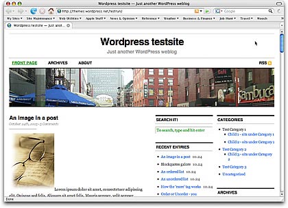
One of the reasons I chose the Cutline 3 Column Right theme for my site’s redesign is because I wanted a three column layout that was wider than my old site. Studies — including stats from all of the sites/blogs I operate — showed that the vast majority of Web site visitors have their screen resolutions set to 1024×768 or wider. I even use that setting on my little 12″ PowerBook. So the old site’s redesign was throwing away 200+ pixels of screen real estate that could be better used providing content or navigation features.

How Do I Use Those Images?

The problem I faced was the header image. Since I built my blog in WordPress nearly two years ago, I had been displaying images that I’d taken during my travels. The images had to be cropped and fit into pre-established format. I used the Random Header plugin to randomize the display. Over 18 months, I’d added nearly 100 images to the header image collection. I’d even begun writing about them in the About the Photos topic. They had become an integral part of my site and I didn’t want to lose them.

So while I continued working on my Leopard book during the day, this little problem was in the back of my mind. For days. One option was to rework the CSS and change the header image so it only took up a portion of the width and use the space beside it for a Web site description. Unfortunately, I don’t know enough CSS to do this successfully without spending hours on trial and error. With a deadline approaching, I couldn’t afford to waste time experimenting. I had to have an answer and be ready to implement it.

About the Photos Images

Then I remembered the smaller images I use in About the Photos to show the images I’m discussing. What if I put three of them side by side and displayed them with some sort of randomizer? Would they fit? What would they look like?

Example ImageThe images in question were 324 pixels wide. The space I had to work with was 970 pixels. 3 x 324 = 972. My luck, sometimes.

I reduced the size of three images to 322 wide and began some quick experiments to replace the existing header image (the street scene you see in the screenshot above) with the three images. I could get them to fit and they didn’t look bad. But I couldn’t get the spacing between them just righ. And I didn’t like the way they fit right up against each other.

A Short Film History Lesson

Then I came up with the film sprocket idea.

For those of you who began using a camera in the digital age and aren’t familiar with 35mm film, let me explain. Before everyone started using digital cameras, serious photographers used 35mm film. The film comes on rolls and has tiny holes along each side. A camera has gears that line up with the holes. You feed the film into the camera and it grabs the holes with its gears. A mechanical lever pulls the next blank piece of film from the film canister to the place in front of the shutter for the next photo. When the roll was finished, the photographer (or his camera) would roll the film back into the canister and the photographer would drop it off for processing. When he picked it up, he’d get prints and negatives. The negatives are the actual film, with inverse (or negative) images on them.

If a photographer had his own darkroom, he’d likely make a contact sheet. This was created by putting the negatives right against a sheet of photographic paper in the dark, then exposing the paper to light for a short time and developing it. The resulting images were tiny (at least they were from 35mm film) and clearly displayed rows of black boxes on either side of the image with black lines between them — like you see here in the header of my redesigned site.

So anyone who has worked with film should recognize these little holes. Of course, my images are considerably larger and wider, so they’re not exact representations of contact strip images. They’re just borrowing the idea.

When I modified the three images to include the borders and fake sprocket holes, I liked what I saw. I created a Photoshop action to modify the 89 remaining images so they were smaller and included the tiny black boxes and borders.

Randomizing

On my old site, the random header image was randomized with a WordPress plugin named Random Header. But since I had three images to show in my header, I needed a different solution. So I turned to the software I used on Flying M Air’s Web site to randomize some of the images there: Random File.

Random File enables you to display random files anywhere on a template. (If you use a plugin like Exec-PHP, you can even display them within posts.) What’s neat about it is that you can tell it how many random files — well, in my case, images — to display and it will display that quantity without repeating them.

After some fiddling around with the CSS used in header.php — remember, I’m no expert — I added the following code in place of the existing header image code:

< ?php $files = array(); for ($i=1;$i<=3;$i++) { $file = c2c_random_file('/wp-content/foldername/foldername/', 'jpg png gif', 'url', $files);
echo 'Random image #' . $i . '';
$files[] = $file;
}
?>

The result is what you see here.

The Hard Part Was Done

With the tough design decision done, I was ready to put the new theme into place. I did that on Saturday, taking most of the day to get it 90% functional. I’m pleased with the results.

Comments? Questions? Use the Comments link or form for this post.

January 3, 2009 Update: I’ve since updated my site’s Web design again and adopted a new theme that does not include photos in the header. So although this information may still be useful to WordPress users, there’s no live example for you to see what it looks like. Sorry.

Web Tools: Color Wizard

An online tool helps a non-designer pick a color scheme for a new blog.

I am not color blind. I know I’m not. I see colors and I know when certain colors look good together. But I can’t, for the life of me, come up with a color scheme on my own.

Color, of course, is a major part of any Web site’s look and feel. So when I found a blog post months ago that listed a few online color tools, I bookmarked them for later use. On Saturday, one of them came in very handy as I decided on a color scheme for my blog’s new look.

The Color WizardThe Color Wizard is a Flash application by Donald Johansson. This excellent online tool helps you find colors that work well together.

From the Color Wizard page:

The color wizard lets you submit your own base color, and it automatically returns matching colors for the one you selected.

It returns a set of hue, saturation and tint/shade variations of your color, as well as suggests color schemets to you, based on your color’s complementary color, split complementary colors, analogous colors and other variations. The color wizard also has a randomize function that lets you generate color schemes you might not have thought of on your own.

It’s the randomizer that helped me. I just kept clicking the Randomize button until I found a few schemes I liked. When I had about eight of them, I went back and reviewed each one, eliminating the ones I liked less until I had one I liked a lot. I then picked the blue color from the theme and generated another scheme from that, so I could get the colors I planned to use for my links.

What was also handy for me was the print feature. Although it’s not obvious on the application, if you right-click the Flash app, a Print option appears in the shortcut menu. I used that to print my two color schemes on my color printer. So not only can I visualize what the colors look like — or at least approximately what they look like; I don’t have a great color printer — but I have a document that clearly lists all the hex codes for all the colors.

I’m so pleased with the results that I clicked the Donate link at the bottom of the Color Wizard and used my PayPal account to send the developer some lunch money. (As usual, I urge everyone who uses great free software like this to thank the developer with a donation or at least a visit to his advertiser’s sites.)

Looking for a color scheme? The Color Wizard is a great place to start.

My First Solo Flight in My First Helicopter

A cool shot taken by my husband.

This is an old photo but one I cherish. I can even tell you the date: October 11, 2000.

Why is it special? It was the first time I flew my own helicopter by myself.

I’d bought the helicopter only a few days before. We’d picked it up and flown it home — Mike and I together. I only had about 80 hours of flight time back then and was nervous. But not nearly as nervous as when I took off from Wickenburg to fly it back to Chandler by myself!

Helicopter Overhead
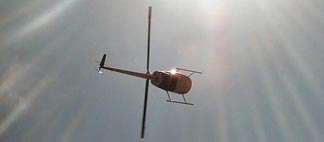
Mike took this shot as I flew by.

I owned the helicopter from October 2000 to October 2004 and put over 1,000 hours on it. It’s an R22 Beta II, which is an excellent one-person helicopter. (That’s a joke, of course. It does have a second seat if you feel like bringing a lightweight friend along.) It’s relatively inexpensive to fly — as far as helicopters go, anyway — and I flew the paint off it (so to speak). I wanted to build time so I could get a job up at the Grand Canyon, which I eventually did.

I sold this helicopter to buy my current ship, a red R44 Raven II. I went nuts for the 2+ months that I had nothing to fly while waiting for the new helicopter to be built. I miss this ship and wish I could have kept it. But I couldn’t swing the two loan payments. (Someone once asked me what it was like to buy a helicopter. My reply: It’s like buying a house and paying for it over 5 years.)

An Eclectic Mind

The site gets a new name, too.

After months of thinking about a new name for my personal blog and book support site, I finally took the plunge. The new name is An Eclectic Mind.

Why Eclectic?

The name comes, in part, from a regular visitor here, Thomas Fucili. He read my post “What’s in a Name?” and responded using the Contact form with a suggestion: Eclectic Pronouncements. I liked eclectic, but didn’t like pronouncements. He came up with a replacement word and I thought deeply about it but made no decision.

ec•lec•tic |iˈklektik|
adjective
1 deriving ideas, style, or taste from a broad and diverse range of sources : her musical tastes are eclectic.
2 (Eclectic) Philosophy of, denoting, or belonging to a class of ancient philosophers who did not belong to or found any recognized school of thought but selected such doctrines as they wished from various schools.

I liked the word eclectic because it seemed to suit the site’s content. As anyone who visits the site regularly knows, I write about widely varied topics. In the world of “pro blogging,” that’s a big no-no. But I’m not blogging to make money, so I don’t really care if the site’s not focused enough to build a high volume of regular visitors and feed subscribers. I write about what interests me, while providing support for the folks who buy and read my books.

The second definition seemed to suit me, too. I don’t think inside the box and can’t be easily labeled. I listen to a lot of theories and opinions and choose the ones that make sense to me — even if they don’t usually co-exist in other people’s belief systems. I’m not a philosopher (although sometimes I do feel ancient) but I’m a strong believer in independent thought.

Eclectic seemed a perfect fit.

The Domain Name Challenge

One of the challenges I faced was coming up with a name that was somewhat (at least) original and still had the domain name available. Although I don’t expect to formally change the domain name for the site, I did want new visitors to be able to find the site by clicking in the domain name with a dot-com at the end. I came up with a few twists on the word eclectic but couldn’t secure the domain names for any of them.

And then, one day, I just came up with An Eclectic Mind. The domain name was available and I bought it. Without really realizing it, I’d settled on a new name.

That was a few weeks ago.

A Day of Changes

I wanted to tie in the site name change to a complete site redesign. So I spent some time looking for the right theme. I found Cutline, which I’ll probably discuss in some detail in future blog posts. I also wanted to [finally] upgrade to the current version of WordPress (2.2.2 as I write this). I knew from experience that the upgrade would break some of my plugins and my current theme. So it made a lot of sense to take a whole day and just do the name change, upgrade, and new theme.

That day was today.

The site’s not done yet — I’m still adding in a few features that my old site used to have — but I expect to be finishing it up over the next few weeks. I’d love to hear your comments about it; use the Comments link or form at the bottom of this post to share your thoughts.

But for now, I just want to thank Thomas for his suggestion. I couldn’t have come up with the new name without his help.

Under Reconstruction

Today’s the big day.

Today is the day I’ve decided to upgrade this blog to WordPress 2.2 (finally). I figured that while I was at it, I’d change the blog’s theme — I’m rather bored with this one — and change it’s name.

So throughout today, this blog will be looking and acting weird. I hope it doesn’t get too weird for me to fix in one day. If all goes well, the blog will be at least 95% fully functional by day’s end, with some features gone and others added little by little over the coming weeks. I’m also hoping to add some new features.

The theme I’ve chosen, a version of Cutline by Chris Pearson, features two sidebars and a wider fixed-width page. This will fill the width of most folks screens and make it possible for me to have more before the “fold.” The second sidebar column will make it possible to display offsite links and advertising separate from internal navigation features. The look is clean and polished, the font is larger, and the theme is more far advanced than what I’m accustomed to, so I’ll have plenty of room to grow and learn.

I’ll tell you more about the blog’s new name and plans for the future when I get the hard stuff done. Stay tuned.

And please have patience if you tune in and see a big mess — or, worse yet — some PHP errors here.