Where do you get your “news” and what are you believing?

My Twitter profile is a simple list of the things that make me me.
In my Twitter profile, you’ll find the phrase truth seeker. I’m occasionally ribbed by far right Twitter users who don’t like my one-liners, often at the expense of people they support, including Donald Trump, Mike Huckabee, Sean Hanity, Bill O’Reilly, and Ted Cruz. These people, who cry “fake news” whenever they hear something they don’t like, wouldn’t know the truth if it hit them with a baseball bat.
But I take truth seriously. I want to know the truth about things. I want to be able to form my own opinions based on facts. I try to be yet another phrase in my profile: independent thinker.
And that’s why I’m so frustrated when people share inaccurate information, including links to false or seriously biased news stories on social media. It was enough to drive me off Facebook and it keeps me fine-tuning the list of people I follow on Twitter.
But what are good, reliable sources of information? Back in February, I blogged about an article in Forbes that attempted to identify some of them. For the most part, I agreed with the list. But it was limited and it failed to indicate any biases or whether the source presented facts, analysis, or opinion.
Some Definitions
Let me take a moment to define each of these, because it’s very important to understand.
- Facts are truthful statements of what is or was. This is black and white stuff that can be proven and is not questioned (except maybe by people who cannot accept the truth).
- Analysis puts facts into context in an attempt to explain why they matter. This can be extremely helpful for folks trying to understand the impact of past and current events and why they should care. Although knowledgable people can often make their own analysis, when there are too many facts that impact a situation for the average person to understand, fact-based analysis can be vital for the average person to make an informed decision. Bias can come into play in analysis, but the best analysis sticks to facts and avoids bias.

The definition of bias.Opinion is what one person or organization thinks about a situation. Opinion can be well-reasoned, based on solid facts and good, informed analysis. It can also be based on false information and similarly flawed analysis. Most often, it’s falls somewhere in between with a mixture of good and bad information and analysis. But it always includes bias, which can seriously degrade the value of the opinion — especially for someone able to think for herself.
So what am I looking for in my news sources? Facts and unbiased analysis so I can make my own opinion.
The Chart
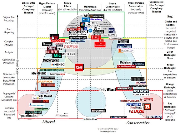
A while back, I came upon an infographic that listed news media sources on a chart. On the Y (vertical) axis was how factual the source was. Higher was more factual. On the X (horizontal) axis was how biased the source was. Middle was unbiased, left was liberally biased and right was conservative biased. The original version of this chart listed quite a few news sources. In answer to a question a Twitter friend asked the other day, I went looking for it online. I found version 3.0, which I’m reproducing in a reduced size here:

Version 3.0 of the chart by Vanessa Otero. (I highly recommend that you click the chart to view a larger size and the article that explains it.) This is an extremely handy tool for evaluating news sources — so handy that I’ve printed out a copy for future reference and will be looking for updates.
Understanding the Chart
No chart is perfect and if you read the comments on the post that explains this version of the chart, you’ll see that people have argued with its author. In most instances, they’re claiming that various sources should be shifted left or right from their current positions.
If you accept that it’s at least 95% representative of reality — which is where I stand — if you’re looking for facts, you should be most interested in the news sources inside the green box. That actually makes me feel pretty good because that’s where most of the news sources I listed the other day reside: the New York Times, Washington Post, BBC, and NPR. In fact, my main source of news is NPR, which is minimally biased fact reporting. I listen to NPR on the radio all day most days when I’m working at home.
If you want analysis, look for sources inside the yellow box. Ideally, you’d want something in the middle of the yellow box, which is nearly empty. One of my favored news sources, the Guardian, falls slightly left in the top of that box; another, the New Yorker, is slightly down and slightly more left. This isn’t terribly surprising since I lean more liberal than conservative in most of my views. Still, neither source is either “hyper-partisan liberal” or “liberal utter garbage/conspiracy theories.” Whew.
The orange and red boxes contain sources that are light on facts, and high on biased opinion. Unsurprisingly most of the news sources listed are either far left or far right. The red box sources are especially troubling in that they include misleading information and/or inaccurate or fabricated information geared toward either far left or far right media consumers. This is where you’ll find Occupy Democrats and the Palmer Report on the left and Fox News and Breitbart on the right. The chart notes that they are damaging to public discourse. (Duh.)
Using the Chart
How do I use this chart? First of all, it’s made me want to spend more time with sources like Bloomberg, Time, and the Economist. These look like they might be good sources of fact and unbiased analysis.
Next, when faced with a “news” story from an unfamiliar source, I’ll look it up on this chart. If it’s in the red box, I’ll basically disregard it. Why should I waste my time trying to figure out what part, if any, in the story is factual? I certainly won’t share it — and I’ll downgrade my opinion of the reliability and judgement of anyone who does.
If it’s in the orange box, I may or may not disregard it, depending on the topic and the availability of corroborating stories. But again, why should I waste my time trying to figure out what to believe in a story?
Instead, I’ll focus on what’s in the green and yellow boxes, as close to the middle of the X axis as possible.
What about You?
What do you think? I’m not talking about the accuracy of the chart here — if you have comments about that, leave them for the chart’s author and she’ll address them. I’m just curious about where people get their news, what they’re looking for, and what they share. Let us know what you think.
And please — do your best to fight real fake news. Don’t share links to unreliable or heavily biased “news” sources.
Discover more from An Eclectic Mind
Subscribe to get the latest posts sent to your email.


My favorite news sources are PBS (miss Gwin Ifill on News Hour, would like more Mark Shields and David Brooks debates), BBC, CNN and MSNBC. I listen to NPR when in the car but mostly hear non-news stuff at those times. I read the NY Times and Time magazine when they become available in our library. I look forward every evening to analysis by MSNBCs Rachel Maddow. Admire her, she reminds me of all the historical events, that I have long forgotten, that lead up to a story. I classify myself as a liberal but one that disagrees with some of the stricter gun control laws.
I don’t get broadcast TV — except for CBS, which I subscribe to via streaming to watch Steven Colbert — and I don’t have cable/satellite, so I don’t get to see CNN or MSNBC or even PBS’s news shows. NPR is, by far, my favorite; especially the shows that don’t necessarily talk about news: All Things Considered, Morning Addition, 1A, PRI’s the World, Science Friday, and, of course, the weekend shows like Wait Wait Don’t Tell Me.
While I agree with the spirit of Rachel Maddow, I avoid watching her because I think she’s a little too far left of where it’s reasonable to be. Ditto for Keith Obermann. They’re kind of outraged and reactionary — at least on the clips I see via YouTube links. I try hard to stay in the middle so I’m not terribly influenced by one side or the other.
Like you, I’m not a fan of strict gun controls. I think reasonable measures — required training, registration, prohibition of assault-style weapons/devices — is better for all of us. Being an “independent thinker” — like you! — I don’t follow one party line to the letter. Why can’t more people — and elected politicians — be the same?
Politics has become too divisive these days and I really think that the media outlets on the far right and left are to blame. They’re brainwashing people, filling them with crazy ideas and hate. It’s a sorry state of affairs.
I found Vanessa’s chart very interesting, thanks for the link.
I think it is important to check out multiple sources to achieve a balanced and informed view. I read the Guardian (mildly left) and the Telegraph (conservative/ mildly right). The Telegraph has the best obituaries of any UK paper but it’s opeds are drivel. The Guardian is fine for international news but inconsistent and muddled for UK news.
My main news source is BBC radio 4 but to provide balance I’ll watch news on BBC and sometimes check out the same items on Russia Today and Al Jazeera. Many times the stories are identical ( perhaps all use Reuters and AP feeds). But on Middle East issues there are stark differences.
Complex stories, such as the current famine in the Yemen, require thorough research as no single source is reliable and bias-free.
Interesting chart, haven’t seen it before, I wish more people were aware of it. I am in the UK and it’s quite clear that the result of the Brexit referendum was strongly influenced by the drivel that some of the UK newspapers got away with publishing.
The problem is, most of the people who need a chart like this would deny that it’s accurate. :-(