
An amazing infographic about the tangible benefits of popular supplements based on scientific evidence.
This is a greatly reduced version of the static image dated January 2014. Don’t strain your eyes to study this — go here to see the full sized image.
Fellow author Tom Negrino shared a version of this infographic on Facebook the other day and I’ve found myself going back to it over and over to study the data it presents.
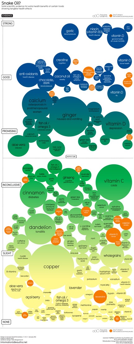
The presentation of the data is pretty straightforward. In each bubble is the name of a supplement and the condition the bubble represents. (If both aren’t listed in the static graphic, try the interactive version; point to a bubble to expand it.) The size of the bubble indicates the popularity (based on Google hits) for the supplement/condition combination. The location of the bubble determines the amount of scientific evidence to support the supplement’s effectiveness for the paired condition — the higher up in the image, the more evidence exists.
So, for example, fish oil/omega 3 appears several times on the chart. in the “Good” area, it’s paired with cancer symptoms, meaning that there is good evidence that it is effective against cancer symptoms. Near the “None” area, it’s paired with Crohn’s disease, asthma, and diabetes, meaning that there is no good evidence that it is effective against these conditions. You’ll find this particular supplement in other areas of the chart, too — I’ll let you explore those for yourself.
Why This Matters
Too many people are relying on supplements to help them with real health problems. They read something online or get advice from their “alternative medicine practitioner” with recommendations and they spend lots of money on pills and powders and liquids at health food stores, hoping to avoid real doctors and real medicine. They think they’re saving money and keeping “big pharma” from getting even bigger. But if they’re using supplements for conditions at the bottom of this infographic, they’re basically throwing their money away.
And that bothers me.
It’s nice to see the research presented in such a user friendly way. Best of all, as the main page for the latest version of this graphic says:
This visualisation generates itself from this Google Doc. So when new research comes out, we can quickly update the data and regenerate the image. (How cool is that??)
So we can expect to see this image modified as time goes on. In fact, you can see previous versions of it on the site if you poke around enough. (Tom, in fact, originally posted an older version that was embedded on another Website.)
Why You Should Care
Now I know some readers are going to push back against this data, possibly with anecdotes about how copper or acai berry or slippery elm helped you or your friend or your sister-in-law’s cousin overcome some ailment. You’re also going to say something like, “It can’t hurt to try, can it?”
You’re wasting your time with such an argument here. I don’t put supplements in my body for a specific problem without scientific evidence that it might actually work. I don’t throw away money on unproven remedies when proven remedies are available.
You probably shouldn’t either.
As for whether it can or can’t hurt to try, it certain can hurt. First, it can hurt your finances by causing you to waste money on something that probably won’t help you. Second, if you rely on ineffective remedies instead of getting real medical care and proven effective remedies, you run the risk of extending or complicating the condition. The What’s the Harm? website summarizes all kind of harm that came to people who relied on “alternative medicine” and supplements. (Alternative medicine is not medicine; if it was proven effective, it would be medicine. Think of aspirin.)
And if you want to explore a similar graphic about “superfoods,” be sure to check out this image.
And now pardon me while I add garlic to my shopping list…
Discover more from An Eclectic Mind
Subscribe to get the latest posts sent to your email.